What's new
Apple iPad Forum 🍎

Welcome to the Apple iPad Forum, your one stop source for all things iPad. Register a free account today to become a member! Once signed in, you'll be able to participate on this site by adding your own topics and posts, as well as connect with other members through your own private inbox!

Grey control center

Timkmco

iPF Noob
Joined
Dec 11, 2013
Messages
5
Reaction score
0
Location
Florida
I bought a refurbished Ipad 2 wifi in January. The refurb was as good as new and I loved it. However after updating to IOS 7, the control center is completely grey with just a little translucency. I've tried every setting and no matter what I do the control center is grey. It's ugly and makes the whole OS look unfinished and like a beta. Also the notification center is very dark, almost black with just a little translucency. Searching around I couldn't find many topics on this problem. So I decided to take my ipad back to apple and they gave me a new one. The new one came with IOS 6 and it reminds me how much I love IOS 6 better than IOS 7. I bought an Ipad 2 instead of an ipad 4 mainly because my eyes could not tell the difference. After upgrading to IOS 7 well now my eyes can tell the difference.

My question to you all is do all of you ipad 2 owners that have upgraded to IOS 7 , is your control center grey? I'm afraid of updating it to IOS 7 because I feel I may have the same problem. The control center should look like it does on the ipad mini and ipad air, but I can't take that grey control center and an unfinished product look. Can anyone post a screenshot of your control center on the Ipad 2? Thanks, Tim
 

J. A.

Super Moderator
Staff member
Joined
Nov 11, 2012
Messages
26,075
Reaction score
26,794
Location
Apetlon, Austria
Hi, Timkmco! Welcome to iPF!

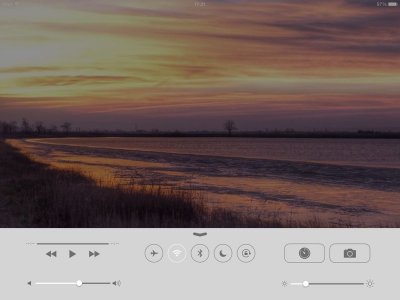
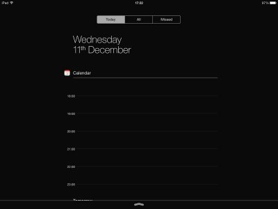
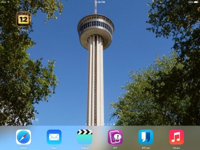
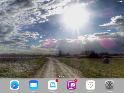
Not only iPad 2, also iPad 3 looks that way. See my screenshots:


image-2965647580.jpg


image-2975516050.jpg

Translucency in Control and Notification Center is available on iPad 4, Air, mini and mini with retina.

I updated my iPad 3 to the new software, and there are loads of features I like. One of them translucency of app folders on my homescreens. I don't mind the grey control center or the dark notification center, most of all because I don't really use them often, and if I do so, they're visible for just a short time.
 
Last edited:
OP
T

Timkmco

iPF Noob
Joined
Dec 11, 2013
Messages
5
Reaction score
0
Location
Florida
Thanks. So it's just not me. I thnk it's ugly and can't believe Apple doesn't think this is a bug. This is my main gripe about IOS 7. My other gripe is the way it zooms in wallpaper, makes any pic I use as wallpaper look low resolution. Also you really notice low resolution on some icons like the lines of the numbers on the calendar icon. Some fonts I notice low resolution. I don't think IOS was really made for a non-retina display. Using IOS 6 everything still looks nice and crisp. I think I'll keep using IOS 6 until they fix this, IF they fix this. I just have to deal with the badge on my settings icon reminding me to update but I'd rather have that than an ugly unfinished beta product.
 

MoonlitSonata

iPF Novice
Joined
May 8, 2011
Messages
2,390
Reaction score
170
Location
Good ol' Midwest
There are some awesome features on 7 that make up for the look, IMO.

Control center is more readily accessible

App switching and closing is easier.

I didn't like iOS 7 at all when I first upgraded but now I wouldn't go back to 6. The main thing I miss about 6 is how iBooks looked, but that's really it.
 
OP
T

Timkmco

iPF Noob
Joined
Dec 11, 2013
Messages
5
Reaction score
0
Location
Florida
I will say that now that I'm back on IOS 6, IOS 6 is way faster and fluid. But I'm sure the arguments between IOS 6 and 7 have already been discussed, haha.
 
OP
T

Timkmco

iPF Noob
Joined
Dec 11, 2013
Messages
5
Reaction score
0
Location
Florida
And speaking of IBooks, why couldn't they have made it translucent like newsstand? One is and one isn't. Makes me wonder what happened to software quality control over there at Apple.
 

J. A.

Super Moderator
Staff member
Joined
Nov 11, 2012
Messages
26,075
Reaction score
26,794
Location
Apetlon, Austria
Thanks. So it's just not me. I thnk it's ugly and can't believe Apple doesn't think this is a bug. This is my main gripe about IOS 7. My other gripe is the way it zooms in wallpaper, makes any pic I use as wallpaper look low resolution. Also you really notice low resolution on some icons like the lines of the numbers on the calendar icon. Some fonts I notice low resolution. I don't think IOS was really made for a non-retina display. Using IOS 6 everything still looks nice and crisp. I think I'll keep using IOS 6 until they fix this, IF they fix this. I just have to deal with the badge on my settings icon reminding me to update but I'd rather have that than an ugly unfinished beta product.
Just to tell you: my daughter uses my "old" iPad 2 with the new iOS, and I never heard her complaining about the software. It works great with her device.

If you take a look at my screenshot with control center: the homescreen is one of the pictures I took. I don't think it looks low resolution, or else I wouldn't use it.
 

J. A.

Super Moderator
Staff member
Joined
Nov 11, 2012
Messages
26,075
Reaction score
26,794
Location
Apetlon, Austria
And speaking of IBooks, why couldn't they have made it translucent like newsstand? One is and one isn't. Makes me wonder what happened to software quality control over there at Apple.
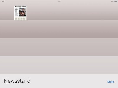
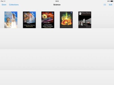
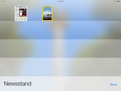
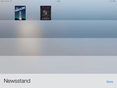
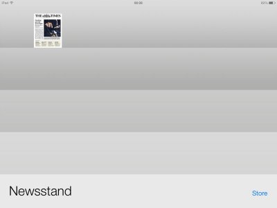
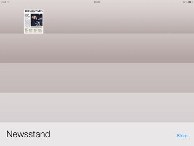
Newsstand as well as iBooks are not translucent on iPad 2 and 3. The only difference is the colour of the app:


image-4036177131.jpg


image-4017689315.jpg
 

scifan57

Administrator
Staff member
Joined
Dec 3, 2011
Messages
35,049
Reaction score
23,323
Location
Regina,Canada
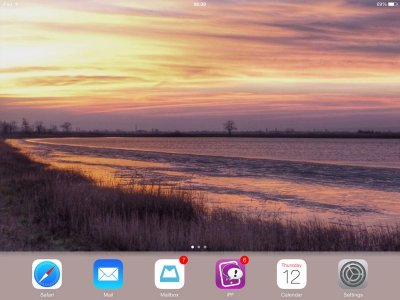
Newsstand is, however, translucent on iPad 4, iPad Air, and iPad mini with retina display.


image-2142043290.jpg


image-1821360201.jpg I've included a screenshot of my home screen to illustrate the point.
 

J. A.

Super Moderator
Staff member
Joined
Nov 11, 2012
Messages
26,075
Reaction score
26,794
Location
Apetlon, Austria
It's also translucent on iPad mini (without retina).

There's no difference on Timkmco's device. That's what I was trying to show.
 
Last edited:
OP
T

Timkmco

iPF Noob
Joined
Dec 11, 2013
Messages
5
Reaction score
0
Location
Florida
Newsstand was translucent when I had IOS 7 on the ipad 2. But not iBooks.
 

J. A.

Super Moderator
Staff member
Joined
Nov 11, 2012
Messages
26,075
Reaction score
26,794
Location
Apetlon, Austria
Well, I use Newsstand every day. I don't remember the app being translucent since my update to iOS 7, and I don't think that iPad 2 would get translucency, but not iPad 3.
 

twerppoet

iPad Fan
Joined
Jan 8, 2011
Messages
24,205
Reaction score
15,573
Location
Milton-Freewater, OR
Newsstand as well as iBooks are not translucent on iPad 2 and 3. The only difference is the colour of the app:

Actually, the Newsstand is a bit translucent on the iPad 3. That slightly brownish red gradient you're seeing in your first screen shot is the result. Mine is bluish, with a hint of brown and white where the owl is.
.
image-3097659385.jpg
.
I assume it is because it's a kind of folder, whereas the iBooks app is an app, and closes the background rather than just appearing on top of it.
 

J. A.

Super Moderator
Staff member
Joined
Nov 11, 2012
Messages
26,075
Reaction score
26,794
Location
Apetlon, Austria
Actually, the Newsstand is a bit translucent on the iPad 3. That slightly brownish red gradient you're seeing in your first screen shot is the result. Mine is bluish, with a hint of brown and white where the owl is. . <img src="http://www.ipadforums.net/attachment.php?attachmentid=51218"/> . I assume it is because it's a kind of folder, whereas the iBooks app is an app, and closes the background rather than just appearing on top of it.
I was comparing these two yesterday (changed homescreens):


image-3002542514.jpg


image-4054652744.jpg


image-2074309907.jpg


image-3021673692.jpg

They do look a little bit different, now that I see them next to each other, but they're not as translucent as yours, by far, if you compare homescreens and newsstand. It should be much lighter on the spot where the sun is, e.g.
 

twerppoet

iPad Fan
Joined
Jan 8, 2011
Messages
24,205
Reaction score
15,573
Location
Milton-Freewater, OR
I was comparing these two yesterday (changed homescreens):
. . .
They do look a little bit different, now that I see them next to each other, but they're not as translucent as yours, by far, if you compare homescreens and newsstand. It should be much lighter on the spot where the sun is, e.g.

Leaving post, because who knows who's read it, but you can ignore my guesswork. I'm pretty sure my next post is the answer.

I think it's because the translucence is a gradient from top to bottom. Your backgrounds get lighter to dark, top to bottom, which is the opposite, muting the affect. My background is pretty uniform, except for the owl, which contrasts a lot with the background and is near enough tot he top to be visible.

When all the issues with how the control panel looks came out, I noted that it seemed easier to find dark backgrounds that looked good with the translucency than lighter or mid toned ones. Still seeing that mostly (mater of taste), but there've been a few exceptions.


And finally, though I'm far from sure, it seems like the translucent effect gets better over a short period of time. Almost as if the iPad is refining how it works with the background for minutes, or even hours, after the initial settings.


Could also be a difference between iPad 2 and 3, if you're using a 2.
 
Last edited:

Most reactions

Latest posts

Top