You are using an out of date browser. It may not display this or other websites correctly.
You should upgrade or use an alternative browser.
You should upgrade or use an alternative browser.
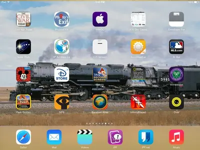
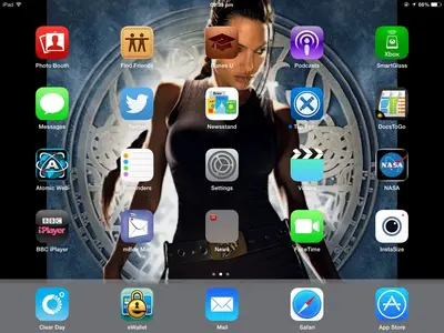
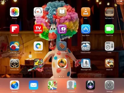
Is the bottom grey bar supposed to look like this.
- Thread starter Gazzaho
- Start date
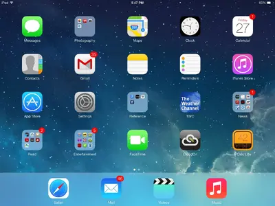
That's what the dock at the bottom of the home screen is supposed to look like. The colour is not always grey though, it takes it's colour from whatever wallpaper you have installed. Here's my home screen.Is the bottom grey bar supposed to be this opaque? See picture below. <img src="http://www.ipadforums.net/attachment.php?attachmentid=48599"/> There is next to no transparency at all with the bottom bar on my iPad 4, it effectively decreases wallpaper size a considerable amount in landscape mode. Not to mention looking brute ugly.

That's what the dock at the bottom of the home screen is supposed to look like. The colour is not always grey though, it takes it's colour from whatever wallpaper you have installed. Here's my home screen. <img src="http://www.ipadforums.net/attachment.php?attachmentid=48600"/>
Thanks, it's not just my iPad then, I wish they had incorporated a translucency slider to adjust it, at the moment it's "in your face" intrusive, same with the folders, especially when they're open, all you get is a ugly single colour box. The UI as a whole is a backward step IMHO. Let's hope they give us some degree of personalisation in a later update.
I can understand why owners jailbreak their devices, Apple needs to stop treating their customers like drones with their one way attitude. We're all individuals with differing views of aesthetics.
LannyC
iPad Fan
silverado8405
iPF Noob
Personally I'd rather have a transparency slider that I could adjust. I liked the "floating" look of the previous iOS.
Sent from my iPad using Tapatalk
Sent from my iPad using Tapatalk
Personally I'd rather have a transparency slider that I could adjust. I liked the "floating" look of the previous iOS. Sent from my iPad using Tapatalk
I have to agree, as I said we're all different. I would like the choice in how my iPad looks, as it stands now Apple aren't giving us a choice at all. The whole look of this OS is characterless to me, the new icons and overall appearance is "flat" and boring, and dare I say it, a little cartoonish. Someone suggested in a post I read that the look of IOS 7 was designed by "Toys R Us" and I laughed at the comment, not because it was particularly funny, but because I was thinking along the same lines myself, it looks to me like what you would find on a child's toy computer.
Some like it, others hate it, if we could customise it to our taste perhaps we would all be happy.
abababababab
iPad Fan
Mine was translucent at first. After I played about with the 'reduce motion' button, it turned grey, and my iPad became ugly.
Similar threads
- Replies
- 1
- Views
- 7K
- Replies
- 0
- Views
- 3K
- Replies
- 2
- Views
- 3K


