What's new
Apple iPad Forum 🍎

Welcome to the Apple iPad Forum, your one stop source for all things iPad. Register a free account today to become a member! Once signed in, you'll be able to participate on this site by adding your own topics and posts, as well as connect with other members through your own private inbox!

Numbers graph...how to change Y axis data to X axis

OP
larrycruzen

larrycruzen

iPF Novice
Joined
Sep 17, 2012
Messages
104
Reaction score
21
Location
Watts Bar Lake, Ten Mile, Tennessee
Don't think I posed my question clearly.

I have a matrix consisting of only 4 columns. All 4 are data columns because header columns won't plot properly on a scatterplot.
Leftmost column is time, derived from the iPad clock.
Second column is a data input column
Last 2 columns are calculated variables dependant upon input.
Scatterplot won't plot the dependant variables vs time.
Selecting the chart and "edit references" shows all columns as Y axis.
I need to change the time column to X axis, hence my question about how to do that.
There are some other complicating factors involved here, but I just want to know to select the chart, then "edit references", then change a column from Y to X axis.

Larry Cruzen
 

twerppoet

iPad Fan
Joined
Jan 8, 2011
Messages
24,211
Reaction score
15,584
Location
Milton-Freewater, OR
Ignore the following and go straight to the next post. This is left as living proof that I am indeed often wrong. It also contains some side comments that are less wrong.


I think I see what you are trying to do. If I'm right, then I've tried to do it myself, and you can't do it with any of the chart types available in numbers. What you really need it a graphing calculator. Something that is not based on cells. Here are the reasons why.

No matter what you do, at least one axis of the chart is going to represent a cell's position. When we plot against a column with regular time intervals (day, week, hour, whatever) we get the illusion that were are displaying values vs time; however, when those time intervals are no longer regular (random sample times) then that illusion is broken. All we have are a list of times and their associated values ploted next to each other. There is no way to show, visually, the duration between those values. Flipping the y-axis wont' change that, it just makes the same error verticle instead of horizontal.

That is the nature of a chart. You can't fix it by forcing the time value to the other axis (even if the chart type permitted it).

The reason is feels like it should be possible is that a scatter chart looks a lot like a graph. On a graph both axis are based on values. There is no option to display a graph within Numbers, though you could probably export a chart (as a csv) to a graphing calculator or app.

The only thing you can flip on a scatter chart is the column/row relation ship between the x-axis and the chart. This means that the chart will use a series of rows as data positions instead of a series of columns. It's kind of confusing to me, so I'm not sure how to describe it. Experimenting with the feature is probably the best way to get an idea of what it does. The esstial information I'm trying to impart is taht the chart will still show the data points along the x-axis. Apple has not supplied any way to show data points on the y-axis of a scatter chart. The only charts that have this feature are the bar charts.

( column/row switching found under the gear icon when in reference editing view)

Image.jpeg


I'm including a couple of badly drawn illustration to show the difference between a chart (spreadsheet) and a graph. If I'm still completely off base on what you are trying to do, please take another whack at describing it, with screenshots if possible.

Image.png


Image.png
 
Last edited:

twerppoet

iPad Fan
Joined
Jan 8, 2011
Messages
24,211
Reaction score
15,584
Location
Milton-Freewater, OR
I was wrong. Apparently as long as the x-axis is not a header/lable colum and the values in the cells are plotable, the x-axis will also be value based. Making it look neat is a matter of playing with the value scale settings.

If the time/date information you are gathering is plotable, all you have to do to get it on the y-axis is make sure it's the second series you select. Use the other values as your x-axis.

This may require re-arraigning your columns. Easies enough. Tap the letter bar on the column so the entire column is highlighted, then drag the column to it's new location.

IMG_1914-2.png


And again in Edit References view:

IMG_1916-2.png


This retraction curtesy of gass induced insomia.
 
OP
larrycruzen

larrycruzen

iPF Novice
Joined
Sep 17, 2012
Messages
104
Reaction score
21
Location
Watts Bar Lake, Ten Mile, Tennessee
What in the world are you doing up at 5:12 AM?

Thanks for hanging with me on this.

As I mentioned, there are some complicating factors here. In order to lay it all out, I will need to post several screen shots. Problem is, I don't know how to do that. When I touch the "image" icon next to the smiley face, it asks for the url. Don't know the url of the screen shot.

Larry Cruzen
 

scifan57

Administrator
Staff member
Joined
Dec 3, 2011
Messages
35,054
Reaction score
23,341
Location
Regina,Canada
Try tapping on the Upload A File button at the bottom of the posting box, then tap choose file in the pop up that appears. Next, select photo library in the next pop up. Finally select the camera roll and tap on a saved screenshot. When it finishes uploading, it appears below the posting box. Tap on Full Image and it's code will appear in the posting box. The image appears in the post after you tap Post Reply.
 

twerppoet

iPad Fan
Joined
Jan 8, 2011
Messages
24,211
Reaction score
15,584
Location
Milton-Freewater, OR
What SciFan said. If you don't see the Upload A File button, choosing the More Options button will usually take you to an editor widow that does show Upload A File.

IMG_1919-2.jpeg
 

scifan57

Administrator
Staff member
Joined
Dec 3, 2011
Messages
35,054
Reaction score
23,341
Location
Regina,Canada
What in the world are you doing up at 5:12 AM?

Thanks for hanging with me on this.

As I mentioned, there are some complicating factors here. In order to lay it all out, I will need to post several screen shots. Problem is, I don't know how to do that. When I touch the "image" icon next to the smiley face, it asks for the url. Don't know the url of the screen shot.

Larry Cruzen

Try tapping on the Upload A File button at the bottom of the posting box, then tap choose file in the pop up that appears. Next, select photo library in the next pop up. Finally select the camera roll and tap on a saved screenshot. When it finishes uploading, it appears below the posting box. Tap on Full Image and it's code will appear in the posting box. The image appears in the post after you tap Post Reply.

What SciFan said. If you don't see the Upload A File button, choosing the More Options button will usually take you to an editor widow that does show Upload A File.

View attachment 75034
The upload a file button will not appear if you're editing a post that already has pictures in it. That's when twerppoet's advice comes in handy.
 
OP
larrycruzen

larrycruzen

iPF Novice
Joined
Sep 17, 2012
Messages
104
Reaction score
21
Location
Watts Bar Lake, Ten Mile, Tennessee
OK, here goes. I live in an area of no broadband internet access, so all internet data is via Verizon cellular. Not good to overrun the monthly limit, so I track our usage carefully each month. If it projects to overrun, I hide my wife's iPad.

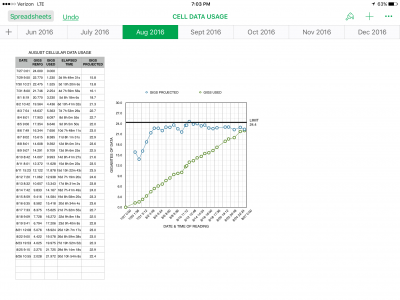
The first image shows a properly functioning chart. It was generated normally by selecting the matrix, then choosing "graph", etc.

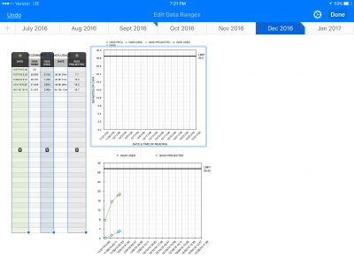
Subsequent months are prepared by duplicating this sheet and deleting the first two columns of independant variables. This saves the formulas, titles and graph formats. A couple of minor changes are required to adjust the number of days in the month, etc.

Problem is, the data won't plot. Selecting the chart, then "EDIT REFERENCES" produces the result shown in the second image. The first column is shown as Y axis. I'd like to change this to X axis.

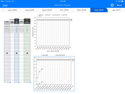
The third image shows the chart when generated by selecting the matrix, then "graph", etc. data plots fine and the first column is shown as X axis. The chart needs to be re-titled and reformatted.

This latter approach is OK, but I'd like to understand what's going on here.

Larry Cruzen
 

Attachments

  • IMG_4979.PNG
    IMG_4979.PNG
    253.4 KB · Views: 373
  • IMG_4980.PNG
    IMG_4980.PNG
    169 KB · Views: 418
  • IMG_4981.PNG
    IMG_4981.PNG
    168.1 KB · Views: 357

twerppoet

iPad Fan
Joined
Jan 8, 2011
Messages
24,211
Reaction score
15,584
Location
Milton-Freewater, OR
I have no idea how the second image got that way. I've never seen a chart that didn't have an x-axis dimension; for the obvious reason that you can't plot a two dimentional graph with only one dimension. If I had the spreadsheet itself, I might be able to figure something out, but from the picture all I know is something is seriously wrong.

You can also tell that something is wrong by the dates being displayed along the x-axis. These look artificial. Unlike the date/times you've entered in the column the x-axis is showing days, but only 0:00 for time. My guess is that the lack of an x-column in the reference has cause the x-axis to be generated purely from the values scale settings of the x-axis. You might try reseting those to Automatic and see what happens (delete what's there to revert to automatic).

Another suggestion, that might help. Try moving the three columns you want on the graph next to each other, starting from the left. It's possible the columns in-between are causing some confusion. If you select and drag the column into the new order the formulas should adjust automatically, but it would be best to do it on test sheet rather than one with valuable data.

That's all I can think of for now.

IMG_1921.PNG
 

Most reactions

Latest posts

Top