What's new
Apple iPad Forum 🍎

Welcome to the Apple iPad Forum, your one stop source for all things iPad. Register a free account today to become a member! Once signed in, you'll be able to participate on this site by adding your own topics and posts, as well as connect with other members through your own private inbox!

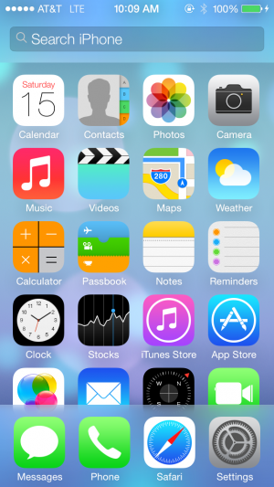
Anyone else HUGELY disgusted by the flat look?

Pinkpoison

Administrator
Staff member
Joined
Jul 8, 2011
Messages
3,884
Reaction score
461
I used it on a friend's phone today (beta version) and it seems faster than iOS6, and the look wasn't really all that different once you add a custom wallpaper. Everything works as it should, and Safari looks like it won't ****me off, so I'm in.
please be careful of your language,this is a family forum.
 
OP
Sonicrobby

Sonicrobby

iPF Novice
Joined
Dec 22, 2010
Messages
502
Reaction score
17
So I just put iOS7 on my iPhone. Here are some notes I have.

-The paralax seems much less defined than what Ive seen on the keynote, but for panorama pictures, its pretty nifty.

-I dont like the headers of the apps (mail, messages, etc.) because they look too much like the new microsoft outlook design.
-Control center is very useful, I love how they put the calculator and flashlight in there, very convenient.

-The lock screen still says "slide to unlock" but no indicator of which direction. To us iOS users, its obvious to go from left to right, but new users of the device may not know that. My initial thought was that you could slide it in any direction to unlock, but sadly I was wrong :(

-Im not sure if its just a beta thing or if apple removed the spotlight search when scrolling all the way to the left. Either way, I like that its gone from there. (its still a feature on the phone though in case some of you were wondering)

-Because all my apps are still designed for iOS 6, i find it extremely weird that the new icons look very blah, but mixed in on that page of icons are some really nice detailed apps (findmyiPhone, whatsapp, machash, chase, etc.)

-I LOVE LOVE LOVE the new multitasking. While they did completely steal this from HPs WebOS, I for one dont mind because that was the only thing I liked from webOS =P Its easier than ever to close apps now.

-Ive long awaited the siri features to be able to control brightness and other toggles, but with control center now easily available i guess siri's new capabilities arent much needed.

-Im still not sure how I feel about the new animation for going in and out of each app (the home screen basically zooms into the app when you open it, and zoom out of the app when you close it). I like the idea of it, but rapidly opening and closing apps will make me dizzy xD

-I definitely welcome the new font, it looks much better IMO

-The new cellular strength signal icon looks unnecessarily large, seems like that bar can get cluttered real easily.

-The weather app looks great. This seems to be the only stock app which uses the simple flat design of the text and symbols, but the complexity and detail of the background. Its a great balance and looks amazing.

-The keyboard is quite alright. I did expect worse from what I saw in the keynote, but its actually not bad. I will really miss the look of the old keyboard though, I personally like the grey/silver scheme more than the white one.

-And finally they added the 'swipe right' to 'go back' feature. I used that on my macbook all the time, I wondered why it took so long to get to iOS. Great addition
 
Last edited:
OP
Sonicrobby

Sonicrobby

iPF Novice
Joined
Dec 22, 2010
Messages
502
Reaction score
17
Features? KILLER! (In a good way)

Icons and color scheme? KILLER! (In a bad way)

I am of the thought the colors, graphics, overall look is childish and a bit confusing. On my MacBook Pro I love the blues, grays and textures of iTunes and the App Store icons. Personally I think these colors better match the simplicity apple seems to strive for. I think it also matches the aluminum, black and white of the hardware. The iPods have multiple colors but even those are a nice soft brushed aluminum look and not the harsh pastels of iOS 7. The features outweigh the colors and mismatched icons but the look distracts from those features. The next three months will be interesting.

Agreed! This, this is 100% how I feel.
 

zstairlessone

iPF Novice
Joined
Jun 22, 2012
Messages
2,052
Reaction score
440
Location
California
Sorry, based on the screen shots I've probably had my last iOS update. I cannot stand the look, it can't be for speed if they spent resources to animate opening and closing apps. It's worse than cluttered, it's blah and it looks cheap! To me it doesn't matter if the phone finds and processes gold, as a phone iOS 7 is going to make it useless. I am sad as this means no more new iDevices for me.
 
OP
Sonicrobby

Sonicrobby

iPF Novice
Joined
Dec 22, 2010
Messages
502
Reaction score
17
So I found the spotlight search. From any page on your home screen, just swipe down on the icons. The spotlight search appears. Hmm... I swear Ive seen something that looks like this before, but where?

IMG_1420.PNG
 

AdmiralAdama

iPad Fan
Joined
Oct 14, 2011
Messages
9,554
Reaction score
628
Location
Near the Ionian Nebula, still searching for Earth
Sorry, based on the screen shots I've probably had my last iOS update. I cannot stand the look, it can't be for speed if they spent resources to animate opening and closing apps. It's worse than cluttered, it's blah and it looks cheap! To me it doesn't matter if the phone finds and processes gold, as a phone iOS 7 is going to make it useless. I am sad as this means no more new iDevices for me.

If it ain't broke ......

AA

Sent from my iPad using iPF
 

Bob Maxey

iPF Novice
Joined
Jan 25, 2011
Messages
1,145
Reaction score
79
Location
Utah
Come on guys and dolls . . . give Apple a break. I read about Blackberry and how backwards it is; how near death is is (OK, it could be) and they launch a new phone that is very un-BB like. MS will not change or innovate, many say and they give us the Surface and their phone OS. Some say Apple needs to change, so they do, and they catch heck because the UI is flat.

Are you all never satisfied?

All I see ahead is Apple suing over the use of flat blue tiles or perhaps Dyson, for making vacumes that look like the Mac Pro.
:D
Here is an idea: JB the thing in three years when they figure out how and add a theme. Or visit Cricket and have a look at the wonderful Samsung Chrono at only $29.99. no need for iTunes Gift Cards, either.

Geesh, Bob is so frustrated. :mad: :D :mad:
 

Pinkpoison

Administrator
Staff member
Joined
Jul 8, 2011
Messages
3,884
Reaction score
461
You know what they say Bob....you can please some of the people some of the time but you can't please all of the people all of the time......well they say that here anyhow ;)
 

Bob Maxey

iPF Novice
Joined
Jan 25, 2011
Messages
1,145
Reaction score
79
Location
Utah
Sorry, based on the screen shots I've probably had my last iOS update. I cannot stand the look, it can't be for speed if they spent resources to animate opening and closing apps. It's worse than cluttered, it's blah and it looks cheap! To me it doesn't matter if the phone finds and processes gold, as a phone iOS 7 is going to make it useless. I am sad as this means no more new iDevices for me.

Really? No, really, really-dealley really, Oh?

The final release will probably be much different than the beta so who knows what will change. No offence, but anyone that turns their back on a device because of the colors and flat icons should never comment about how advanved the iPhone is compared to other phones. We do not purchase devices because of the colors, do we? Some do, OK, but many want a phone that works.

Odd that some hate the new icons lack of depth but they really never praised the iPhone for having 3D looking icons. It is all about how android is terrible and iPhones rule.

All I know is the iPhone is not for me because it has a tiny screen. Can't beat the Galaxy S3.
 

Bob Maxey

iPF Novice
Joined
Jan 25, 2011
Messages
1,145
Reaction score
79
Location
Utah
You know what they say Bob....you can please some of the people some of the time but you can't please all of the people all of the time......well they say that here anyhow ;)

I surround myself with people who better please me or I'll toss a tantrum, dag nabbit.
:mad:
But you are correct.

And do not forget the iFanboys on both sides of the never ending Apple/Android fight. Nothing will please many so why bother.

My guess is Apple is why they have an android phone and a free OS is why there are so many of the blasted things out there. They often cringe when I say the iPhone(s) make more money than the entirety of Microsoft.

Oh well . . . All I know is my mom says I am pretty and that is what I base my life upon. That and my power to control kittens.
 

Pinkpoison

Administrator
Staff member
Joined
Jul 8, 2011
Messages
3,884
Reaction score
461
You're quite right Bob,the finished product may be quite different than the Beta and we should judge it then.
 

Bob Maxey

iPF Novice
Joined
Jan 25, 2011
Messages
1,145
Reaction score
79
Location
Utah
So, lemmme ax you all, if the first iOS looked flat, would we hate the 3D look? I say yes, yes we would. After all, we have forums to complain to, so yes, we would complain.

I say, don't worry, be happy.

New Coke disappeared because people screwed with one of the 4 food groups - soft drinks and Coke changed back. Lest I remind you all, the double-stay corset went away because women sent telegrams. Not to mention, Peter Carl Goldmark's invention is making a comeback.

We can fight the machine and I say we write emails aplenty.

And while you are writing email messages, try to help me get Teaberry, Baby Ruth, Clove, Beemans and Blackjack Gum (and candy cigarettes) back in the stores.
 

Most reactions

Latest posts

Top